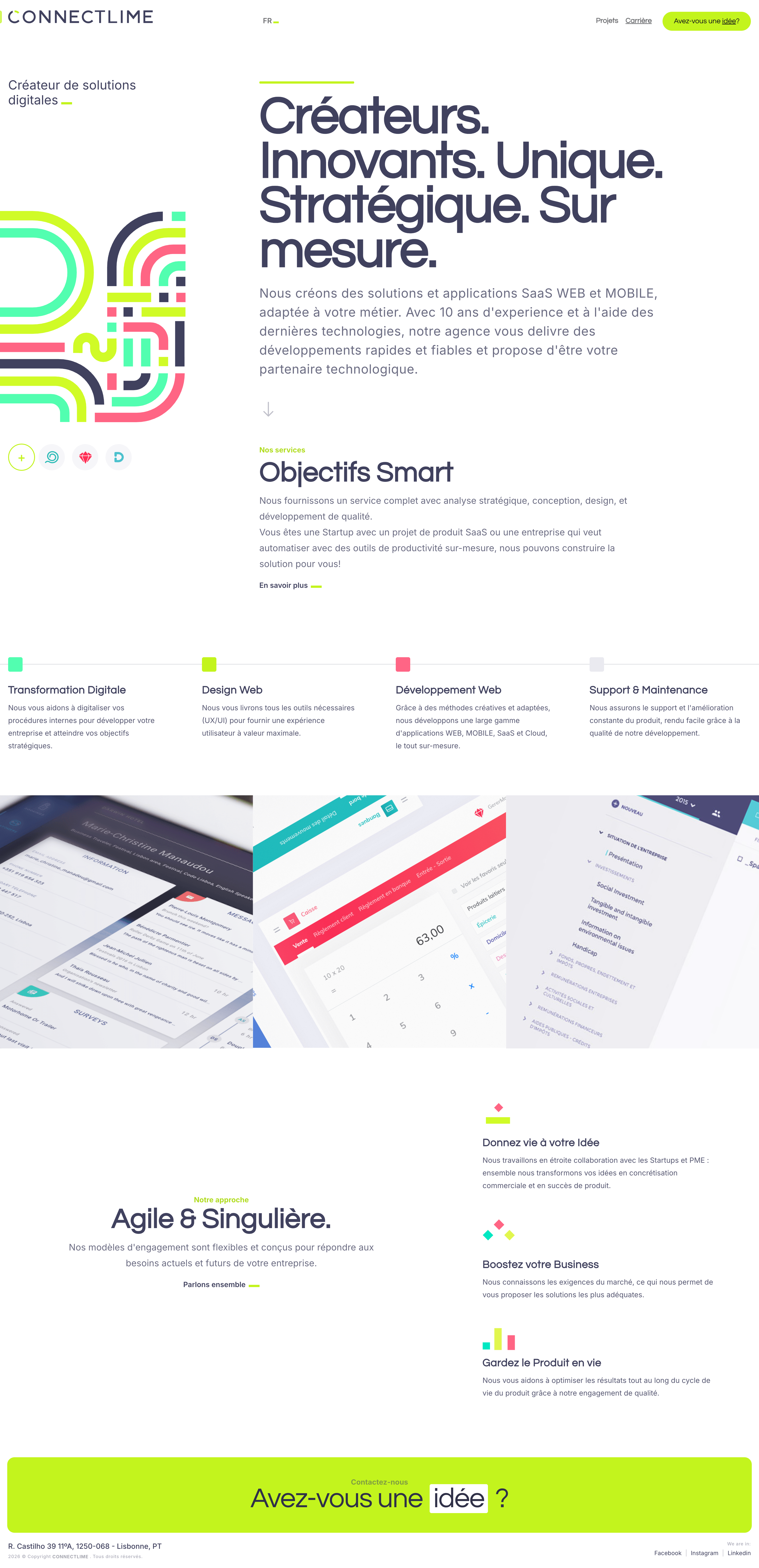
Mentored the wordmark logo. Designed the studio site — the company's public face — and created the geometric line-pattern to carry that identity — clarity and trust for non-technical decision-makers.
- Branding
- Web Design
01 · Context
A Lisbon product studio making its first impression.
ConnectLime is a digital product studio based in Lisbon — design, software development, digital transformation, and support for startups and SMEs.
During the website and brand development phase, the studio still needed to establish differentiation and trust from day one. Fragmented service presentation and weak navigation meant potential clients left without engaging.
The guiding principle:
Stakeholder alignment on 'professionalism through simplicity' as the one decision filter — used to cut everything that didn't serve it.
How do we balance credibility with approachability for SMEs choosing a digital partner?
02 · Identity
A studio presence built for clarity, trust, and warmth.
I mentored the wordmark logo. I designed the bilingual studio site — the company's public face — and created the geometric line-pattern to reflect that identity: brand imagery translated into a digital presence, with a restricted palette and two type families carrying flexibility and adaptability under the stakeholder principle of professionalism through simplicity.
Brand imagery & digital presence
One principle — 'professionalism through simplicity' — aligned with stakeholders before any visual decision. Everything gets tested against it: how imagery reads on screen, how palette and typography carry the story, and how the line-pattern I created punctuates section transitions as an editorial signal for the universe — flexibility and adaptability — not as wallpaper. Wordmark mentorship, the site, and the pattern read as one system.
- Principle — professionalism through simplicity — every decision traces back to it.
- Brand imagery — geometric line-pattern I created and the colour system express the studio's universe on the public site — restraint over decoration.
- Digital presence — bilingual studio site, adaptive theme, and type pairing deliver that intent to SME visitors on the page.
Palette
Typography
Display — Page titles & hero
Questrial
MediumSemibold
Body — UI, body, captions
Inter
RegularMediumSemibold
03 · Key decisions
Decisions that made simplicity the differentiator.
Outcome-focused content preferred by SMEs
Brand audit & competitor analysis.
European product studios and agencies benchmark. Outcome-focused content preferred by the target audience — SMEs scanning for the work, not the methodology.
Content strategy first, identity right after
Content strategy, architecture & visual system.
Content strategy and information architecture sequenced before the visual system, so the site answered the content — not the other way around. I defined palette, typography, and the geometric line-pattern as the signal for the ConnectLime universe — flexibility and adaptability — without wallpapering the UI, alongside mentoring the wordmark logo on the site.
Bilingual and adaptive in production
Website implementation.
Bilingual FR/EN with cultural adaptation — not just translation. Adaptive theme system with intelligent detection of user preferences so the site meets visitors where they are.
04 · In practice
The decision that kept the studio's first expression simple.
Proactive & collaborative
Simplicity over feature density — stakeholder alignment drove faster decisions.
The studio needed a website that would build trust with non-technical SME decision-makers.
The instinct was to add more content — more services, more case studies, more proof points.
Each addition diluted the core message. Professionalism through simplicity landed faster than comprehensiveness.
Prioritised simplicity over feature density. Aligned stakeholders on 'communicate professionalism through simplicity' as the decision filter.
Fewer pages, clearer message, faster delivery. The constraint made decisions easier, not harder.
05 · Implementation
Design and code across the studio's first public surface.
Design
What was designed
- —Guidelines for the studio site — the public face of the company — pattern usage, and wordmark logo mentorship for on-site use, plus component-level specs and bilingual content strategy so the client could evolve the site without breaking the system.
Code
What was built
- —Studio site — the public face of the company — built with Gatsby and React: adaptive light/dark handling from user preference, FR/EN i18n, repository handoff for client ownership.
06 · Results & Metrics
A professional presence shipped on a simplicity budget.
1
Professional digital presence established.
FR / EN
Bilingual i18n — culturally adapted, not just translated.
Adaptive
Theme system shipped in production, responding to user preference.
07 · Trade-offs & Learnings
What stakeholder alignment accelerated.
— Stakeholder alignment on a clear principle — 'professionalism through simplicity' — made every subsequent decision faster. The constraint was the accelerant.
Communicate professionalism through simplicity.
Clarity and trust for non-technical decision-makers choosing a digital partner.