Continente has nearly 30 years of history — Portugal's first hypermarket chain, a cultural leader the whole country grew up with. In 2014, continente.pt carried none of that trust. The Young Lions brief asked us to redesign the homepage. We proposed a full digital experience — homepage, online shop, category pages, and mobile — that would make the site live up to the brand it belonged to.
- Web Design
01 · Context
A cultural retail brand, shouting at itself online.
When you accessed Continente Online in 2014, information hit you from every angle. Every small space shouted, the site couldn't breathe. No clear hierarchy meant shoppers got lost in the search for products, wasting time on things they didn't want to buy.
Continente is Portugal's cultural leader in retail — nearly 30 years of history, the chain that first brought hipermercados to the country. Its digital presence was a completely different approach from what the brand stands for in its physical stores: confusing, disorganised, colder than any aisle. The brief was framed as a homepage redesign. The real task was to close that gap.
Every feature in the proposal was tested against one filter:
Answering that question meant rewriting trust, the shopping list, the internal brands, social, and help — all under one governing principle: mais humano no digital.
What does Continente feel like — and why doesn't the website feel like that?
02 · Key decisions
Decisions that made the site feel like the brand.
Certainty as the default state
Layout built so shoppers know exactly what they're doing.
In a physical store, trust is built through time, presence, and repetition. Online it collapses on the first unclear button. We designed a layout that makes certainty the default: simple, intuitive, no fear of buying online. Conditions that make the purchase as trustworthy as shopping in person, just faster and more convenient.
List before login, always
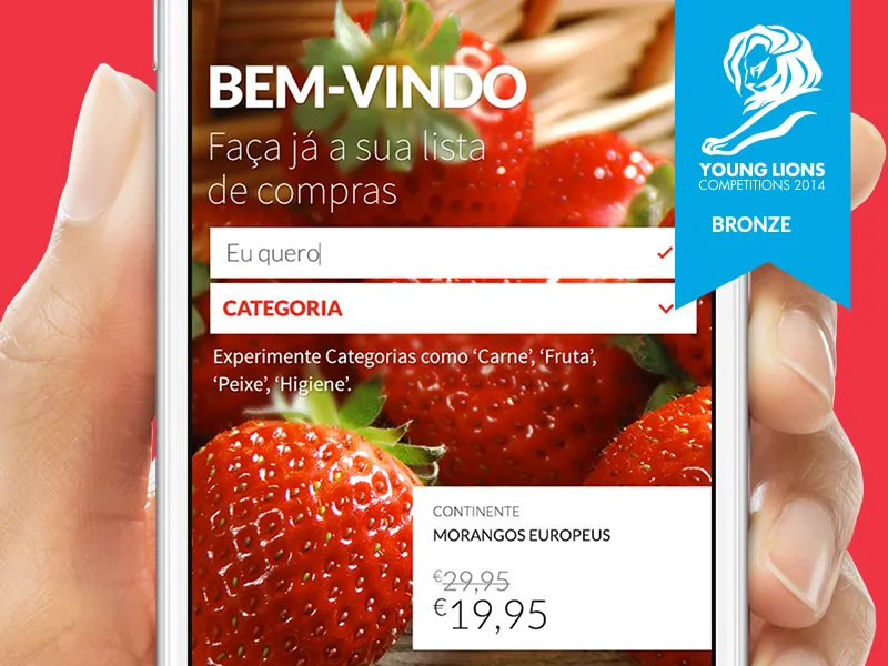
'Faça já a sua lista de compras.' The useful thing before the transactional one.
The old flow demanded login before any meaningful interaction. We flipped it: shoppers create the list directly on the homepage, before login, before any commitment. The list can be exported, saved, sent to someone, or used as the spine of a logged-in purchase. The site adapts to the shopper's intent, not the other way around.
Primitive · List-before-login
Internal brands as a digital market
Conte com Mais — a tabbed storefront for each of Continente's worlds.
Continente's internal brands — Chef Online, Universo Bebé, Missão Sorriso, Hiper Saudável, Clube dos Produtores, Beleza Online — each had distinct audiences. We built them as a horizontal tabbed 'Conte com Mais' section on the homepage: a digital market of Continente's worlds, each tab a micro-storefront for a different kind of shopper.
Primitive · TabbedBrandMarket (Conte com Mais)
Community as a trust signal
Per-product share, shareable lists, and group carts.
Product pages carried a share-to-friend action. Shopping lists could be shared on social. Group shopping lists let friends add to the same cart — party planning, family holidays, house-share fridges. In 2014 this was ambitious; a decade later the pattern is industry-standard in grocery apps.
Help as structure, not hidden menu
Tutorial, video, and support built into the architecture.
A real-time step-by-step tutorial walking alongside new users. A short video showing how to complete a purchase. A feedback form always reachable. The support number visible throughout. Help built into the architecture rather than buried under a question-mark icon — because 'mais humano no digital' was only true if the interface treated the user like someone who could ask questions.
Primitive reference
- TabbedBrandMarket (Conte com Mais)Six internal brands as a horizontal tabbed micro-storefront on the homepage.
- ShoppingListBuilderList-first entry on the homepage — exportable, shareable, portable into a logged-in order.
- PersistentCartCart pinned top-right across every page — visible even when anonymous.
- HelpAsStructureReal-time tutorial, purchase video, feedback form, support number — built into the chrome.
- List-before-loginThe useful action ships before the transactional one.
- Three-block homepage, three jobsLoja, Conte com Mais, Institutional — each block scaled to its own intent.
- Interactive vs Institutional menuNavigation split by intent instead of by org chart.
03 · In practice
Two decisions that made the homepage stop shouting.
Design rationale
Shopping list built without a login wall.
Make starting an order feel as low-commitment as jotting a list on paper.
The old flow demanded account login before any product interaction — every shopper's first experience was a form.
Trust isn't earned by asking for credentials first. It's earned by letting the shopper do the useful thing before the transactional one.
Shopping list creation lives on the homepage, no login required. Login is only introduced at the point of actually buying.
The first meaningful interaction became creating, not identifying. A pattern now standard across grocery retail — ambitious in 2014.
Systems thinking
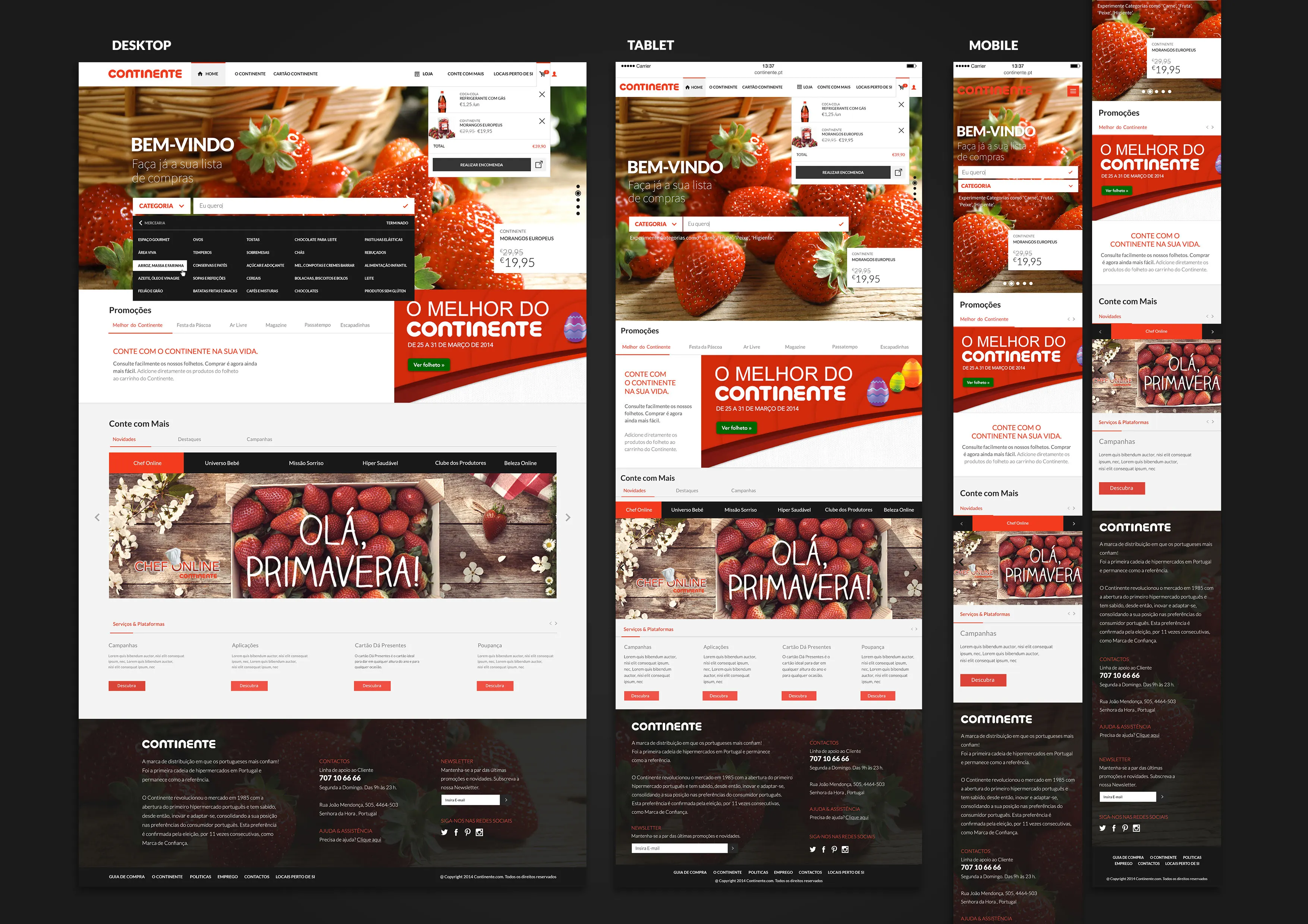
Three-block homepage, three different jobs.
Fit Loja, Conte com Mais, and Institutional content on one page without any of them competing for attention.
The old homepage stacked promotions without hierarchy — every item shouting the same volume.
Those three aren't one homepage — they're three mini-homepages with different intents: buy, discover, understand the brand.
Explicit block structure. Loja at the top (shopping intent), Conte com Mais in the middle (brand discovery), Institutional at the bottom (trust-building). The menu was split the same way: Interactive vs Institutional.
The homepage stopped asking shoppers to triage — each block spoke to a different intent at the right scale.
04 · Implementation
Design across homepage, shop, and responsive surfaces.
Design
Brand & narrative
Positioning line 'Conte connosco. Confie no Continente.' — a covenant in two clauses, built from the brand's own voice. 'Mais humano no digital' as the guiding principle — every feature tested against whether it made the user feel like a person, not a consumption target. Natural seasonal photography (strawberries for spring, Easter campaign) — warmer than the flat catalogue shots the brand had been using online.
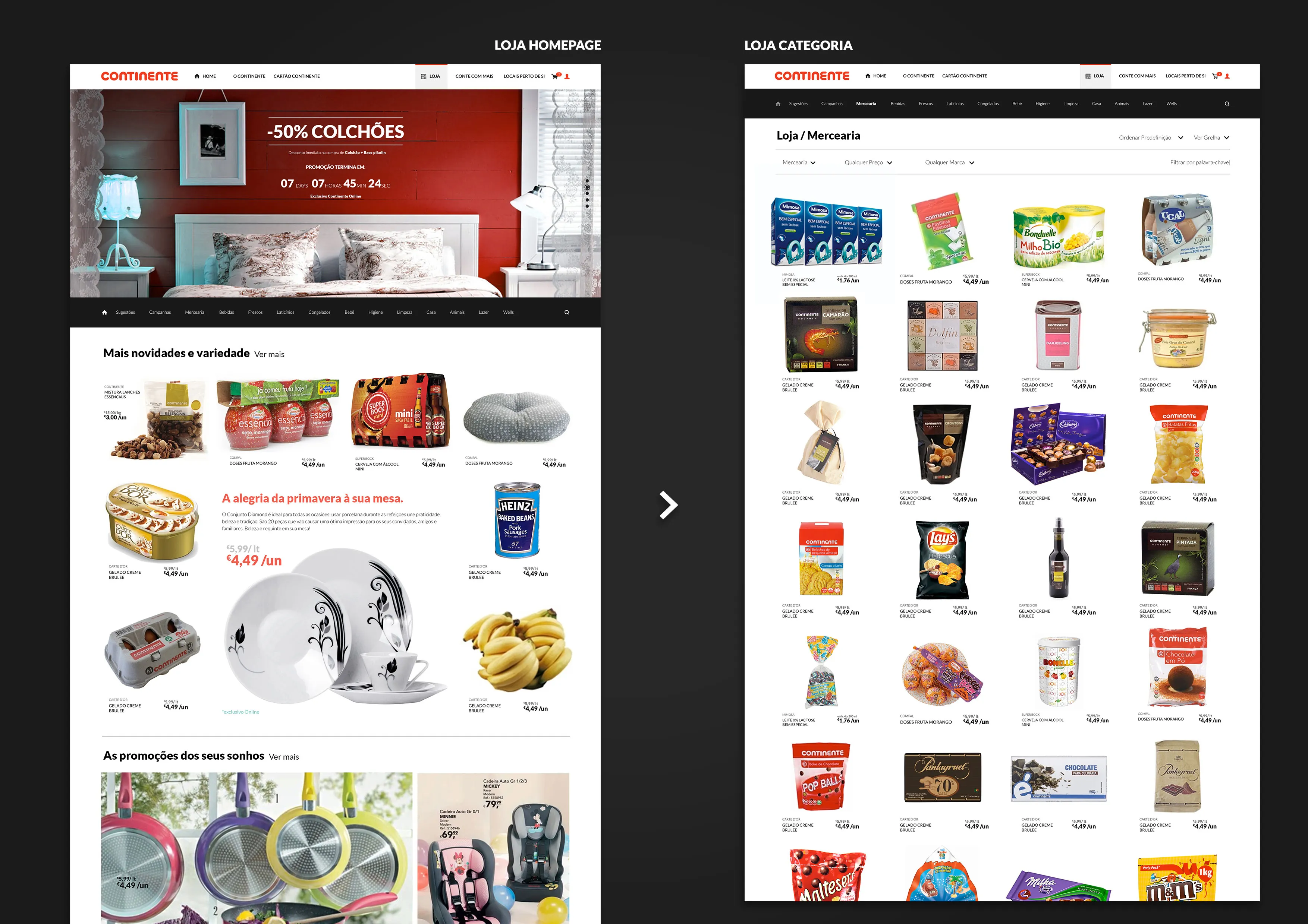
Homepage & online shop
Three-block homepage: Loja (hero slider + shopping list creation), Conte com Mais + Serviços & Plataformas, Institucional (contacts, newsletter, social). Menu split into Institutional (O Continente, Cartão Continente) and Interactive (Loja, Conte com Mais, Locais perto de si). Persistent shopping cart in the top-right, visible across every page — even without login. Promo slider: Novidades, Promoções, Cartão Continente offers.
Social & help
Per-product Facebook share for recommendation. Shopping list shareable on social networks; collaborative group list with Facebook friends. Step-by-step real-time tutorial, purchase video, always-visible feedback form and support number. Desktop, tablet, and mobile layouts all designed — mobile-first shopping-list entry on small screens.
05 · Results & Metrics
A proposal that aged well — shopping-list-first is now standard.
Bronze
Young Lions Portugal 2014 — Internet / Cyber category.
3
Surfaces designed end-to-end — homepage, online shop, category pages — plus responsive layouts across desktop, tablet, and mobile, with mobile-first shopping-list entry.
1
Positioning line shaping the whole proposal: 'Conte connosco. Confie no Continente.'
06 · Trade-offs & Learnings
What the long-term look-back taught.
— The proposal was built from real UX pain, not a brief in the abstract. Before drawing anything, we used the existing site ourselves, got lost, timed how long finding a product took, catalogued the interface shouting at us. That grounding shaped every decision.
— 'Mais humano no digital' was the compass. Every feature was tested against whether it made the user feel like a consumer, not a consumption target. If it couldn't survive that test, it didn't ship in the proposal.
— A decade on, the shopping-list-first pattern is industry-standard in retail apps. The social-shopping ideas — per-product recommendation, collaborative lists — landed earlier than the market could absorb them. The 'extension of the consumer' framing from the rational is how I'd describe user-centred design today.
— What I'd do differently: push the mobile-first architecture harder from the first sketch; invest more in accessibility (2014 WCAG practice was rudimentary by today's standards); and treat help-as-structure as the central claim, not a supporting detail — it's what made 'mais humano no digital' actually true at the interaction level.
Mais humano no digital.
Conte connosco. Confie no Continente.