Case study
A product you invite into your personal data life.
Cube asks users to hand over login credentials for their bank, telecoms, insurance, and retail accounts so automated agents collect documents on their behalf. The design problem: making something inherently invasive feel safe, clear, and worth doing — across 300+ integrations, designed and shipped in production code. Typography, grid, and visual detail aren't afterthoughts — when a product has to earn trust before a single interaction, craft is doing functional work, not decorative work.
- Branding
- Product Design
- Web Design
01 · Context
Credentials, handed over.
Users had to trust a product with their login credentials for every provider — bank, telecoms, insurance, retail. Securibox's agent technology automates document collection through those stored credentials; the technology worked. The design problem sat on either side of that: the moment of handover, and every signal afterwards that said "yes, this is still safe."
An unclear sync status, a missing storage path, an unexplained error — any of these could shatter confidence. Both Cube (consumer) and the SCA BackOffice (developer/operator) share the same underlying solution: Securibox CloudAgents. I designed the product experience and built the frontend for both, but the audiences diverge completely — Cube needed emotional safety and progressive disclosure; the BackOffice needed operational density and configuration precision.
Users already wanted to automate. The only question that mattered:
Can I trust you with my credentials?
02 · Identity
A sub-brand, built to belong and stand apart.
Cube needed to feel distinct from Securibox corporate — approachable, personal, consumer-grade — while clearly belonging to the same family. The tension surfaced in every colour and type decision. Too far from the parent brand and enterprise clients question the relationship; too close and consumers feel they've landed in a B2B tool. Resolution: accent colour and tone of voice, not structural divergence.
Logo & mark
Cube had to feel like something a user would invite into their personal data life — approachable, warm, trust-led — while still reading as part of Securibox. The bet: resolve the tension through accent colour and tone of voice, not structural divergence. Same type system, same geometry, same spacing rhythm as the family — different temperature.
- Belonging — shared structural system with Securibox corporate — no reinvented chrome, no re-learned affordances.
- Standing apart — magenta accent, warmer type choice, plain-language voice — signals consumer without abandoning the family.
- Logomark — a single cube primitive — discrete units of data, stored as cleanly as books on a shelf.


Palette
Typography
Display — Headlines & moments
Rubik
RegularMediumItalic
Body — UI & long form
Manrope
LightRegularMediumSemibold
03 · Key decisions
Design decisions that made trust legible in daily use.
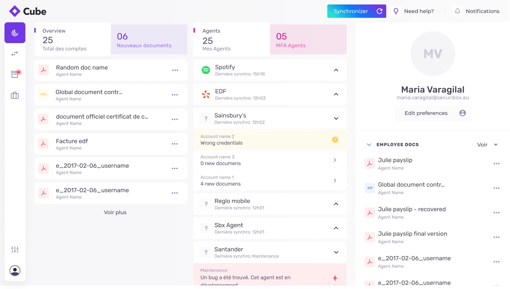
Same screen, different zones
Credentials and sync status on one view — spatially separated, not behind a tab.
The instinct is to put sync status on a separate screen. Instead, credentials live on the left, synchronisation status on the right — same view, different zones. Users returning to check on an agent shouldn't have to navigate away to confirm it worked. The MFA button is persistent in the top right. The folder path breadcrumb appears here too — seeing exactly where documents will land, at the moment of saving credentials, reduces the anxiety that the data is going somewhere unknown.
Primitive · CredentialSyncPanel
Two views for 300+ agents — both necessary
List for the user who knows. Grid for the user who's exploring.
A user who knows exactly which provider they want needs a scannable list with status at a glance. A user exploring needs logo density — to feel the scale of what's possible. List view: provider name, document types, last sync, connection status in one row. Card view: same data, denser grid, prioritising provider identity. The filter sidebar is identical in both modes. The "Unavailable" badge was a late decision: a status dot alone wouldn't let users distinguish working from unconfigured at scan speed, so the explicit text label was designed alongside the colour signal from the start.
Primitive · AgentsIndex
The third column that refused to disappear
HR documents pushed by the employer, kept visible and labelled — never pretending to be user data.
The dashboard has three columns: My Collection (user-pulled documents), My Agents (configuration and status), and HR Documents pushed by the user's employer. The tension: Cube is a product the user controls; HR documents arrive without user action. The decision was to keep them visible but explicitly labelled and spatially separated — an "HR DOCUMENTS" header — so the source is always legible. The files explorer follows the same rule: Securibox-collected folders, employer folders, and personal cloud appear as siblings under the same root. Different origins, unified view — never presented as if they came from the same place.
Primitive · Source-labelled surfaces
Primitive reference
- CubeAgentAgent card communicates full provider lifecycle without opening.
- CredentialSyncPanelCredentials on the left, sync status on the right — same view, different zones.
- AgentsIndexCard for scanning, list for triage. Shared filter, sort, selection.
- FileTreeStorage sources from multiple origins rendered as one unified tree.
- DashboardSummaryThree legible zones — My Collection, My Agents, HR Documents.
- Silence is a stateA sync that returned nothing new is first-class — not an error, not an empty state.
- Consent before capabilityNo credential, storage request, or sync toggle without scope, source, retention visible.
- Error in the user's languageProvider errors translated: what happened · what we're doing · what you can do.
- Source-labelled surfacesUser-pulled, HR-pushed, cloud-mirrored — always labelled, never conflated.
04 · In practice
Two edge cases that taught the product.
Edge cases
The "Unavailable" badge — designed in from the start.
Agent card grid needed to communicate three states: active, available to configure, temporarily offline.
A colour-coded status dot alone forces users to learn a legend before the interface makes sense.
If someone has to pause and decode a signal, it's not a signal — it's a puzzle. The pain point was obvious before it ever reached a user.
Designed the explicit "Unavailable" text label alongside the colour dot from the start — redundant by design, not by accident.
Status legible at scan speed from day one. No user ever had to guess what the dot meant.
Production-informed iteration
The step-by-step walkthrough removed after launch.
Onboarding needed to guide new users toward configuring their first agent.
The walkthrough created commitment pressure — users felt pushed to act before they understood the product.
Guided tours optimise for activation metrics. The product needed to optimise for trust — a user who browses first commits better.
Removed the walkthrough. Replaced it with a single clear entry point: "Configure your first agent." Options reveal only after interaction.
Progressive reveal over guided tours. Users explored before committing — no onboarding friction disguised as help.
05 · Implementation
Design and code across the full product surface.
Design
Brand, concept & narrative
- —Cube as a distinct sub-brand: logo, colour system, typography, iconography, and visual hierarchy — approachable and trust-led, not generic B2B chrome. Distinct from Securibox corporate, but unmistakably part of the same family.
- —Positioning and story: "Own your data" and plain-language automation — the idea of agents and credential-based sync framed before the ask, so the product reads as understandable personal control rather than opaque infrastructure.
- —Marketing site designed alongside the app: landing story order, security posture page, pricing — bilingual FR/EN copy throughout, so value and trust build before install.
Setup & configuration
- —Agent discovery: list and card modes sharing one filter sidebar with a 12-category document taxonomy, sort controls, and view toggle; explicit "Unavailable" labelling when an integration is offline; "Add suggestion" CTA for provider requests.
- —Credential and synchronisation: credentials and sync status kept in the same view but spatially separated — so users never navigate away to confirm an agent worked. Persistent MFA entry, masked fields, help tooltips, password visibility toggle, and a breadcrumb showing exact storage path at the moment of saving.
- —Connected-app settings and revoke patterns for cloud destinations
Ongoing use
- —Dashboard designed as a single surface across screen sizes: summary metrics bar (accounts, documents, agents, delivery status) followed by three legible source columns on desktop and stacked sections with bottom tab navigation on mobile. Inline agent status expansion showing file count or contextual error without navigation; HR Documents spatially separated and explicitly labelled.
- —Folder tree rendering multiple storage sources (Securibox, employer, Google Drive, OneDrive) as one unified view — different origins, one browsing experience.
Code
Marketing site
- —Gatsby static generation with bilingual FR/EN routing and SEO — chosen for performance and crawlability on a site that needs to build trust before the user ever sees the app.
- —Multi-page structure: landing (agent carousel, value proposition, setup flow), security (encryption posture, data handling, trust signals), and pricing — each page designed as a standalone entry point with its own content hierarchy.
- —Agent carousel on the landing page: rotating provider cards with category labels, activation CTAs, and background brand pairings — showcasing the breadth of integrations before sign-up.
App shell & agent views
- —React with a Vite-based toolchain; FR/EN i18n throughout. Shared component patterns with the SCA frontend where the underlying API endpoints overlapped.
- —Agent views: grid and list rendered from the same data source and shared filter state — one taxonomy and sort model driving both expressions, so switching view mode preserves filter context.
- —Credential UI: help tooltips, password visibility toggle, persistent MFA action; synchronisation status panel consuming API sync history and document counts.
Dashboard, files & settings
- —Summary metrics bar and three-column layout; inline agent status expansion with conditional rendering (file count vs error state); mobile reorganisation to single column with bottom tabs.
- —Files explorer: folder tree rendering multiple storage sources (Securibox, employer, Google Drive, OneDrive) as one unified view; storage capacity visualisation.
- —Connected applications: settings and revoke flows for cloud destinations in the UI.
06 · Results & Metrics
Operational scale and product clarity, measured.
300+
Agent integrations across banking, telecoms, insurance, utilities, retail, HR.
12
Document-category taxonomy powering agent discovery.
2
View modes from the same component system.
FR / EN
Bilingual app, marketing site, and onboarding.
07 · Trade-offs & Learnings
What the long build taught.
— Cube as a sub-brand had to feel distinct from Securibox corporate — approachable, personal, consumer-grade — while clearly belonging to the same family. The tension surfaced in every colour and type decision: too far from the parent brand and enterprise clients question the relationship; too close and consumers feel they've landed in a B2B tool. The resolution was accent colour and tone of voice, not structural divergence.
— Maintaining two build systems — Gatsby for the marketing site and React/Vite for the app — introduced overhead. The trade-off was worth it: the marketing site needed static generation, SEO, and fast first-paint; the app needed SPA routing, shared state, and component reuse with SCA. Keeping them separate meant each could optimise for its audience without compromising the other.
— The landing page (cube.securibox.eu) was designed alongside the app — not after it. It handles the first layer of understanding (what agents are, how sync works) so the app itself can skip the explainer and let users explore immediately.
— Designing mobile as a dedicated single-column layout with bottom tab navigation — rather than a responsive adaptation of the desktop grid — meant maintaining a parallel layout system. The payoff: the mobile experience reads as intentional, not squeezed. The cost: every new dashboard feature ships twice.
Trust is the product. Everything else is plumbing.
300+ agents, one credential moment — designed so the hardest step feels like the safest one.