Case study
Your identity,legible
— not buried in a policy.
Designed and built the account hub that gives users a single home for their identity, connected services, and data-use transparency across the Securibox ecosystem — with inline explanations of how each piece of personal data is used.
- Product Design
01 · Context
Identity scattered across every product.
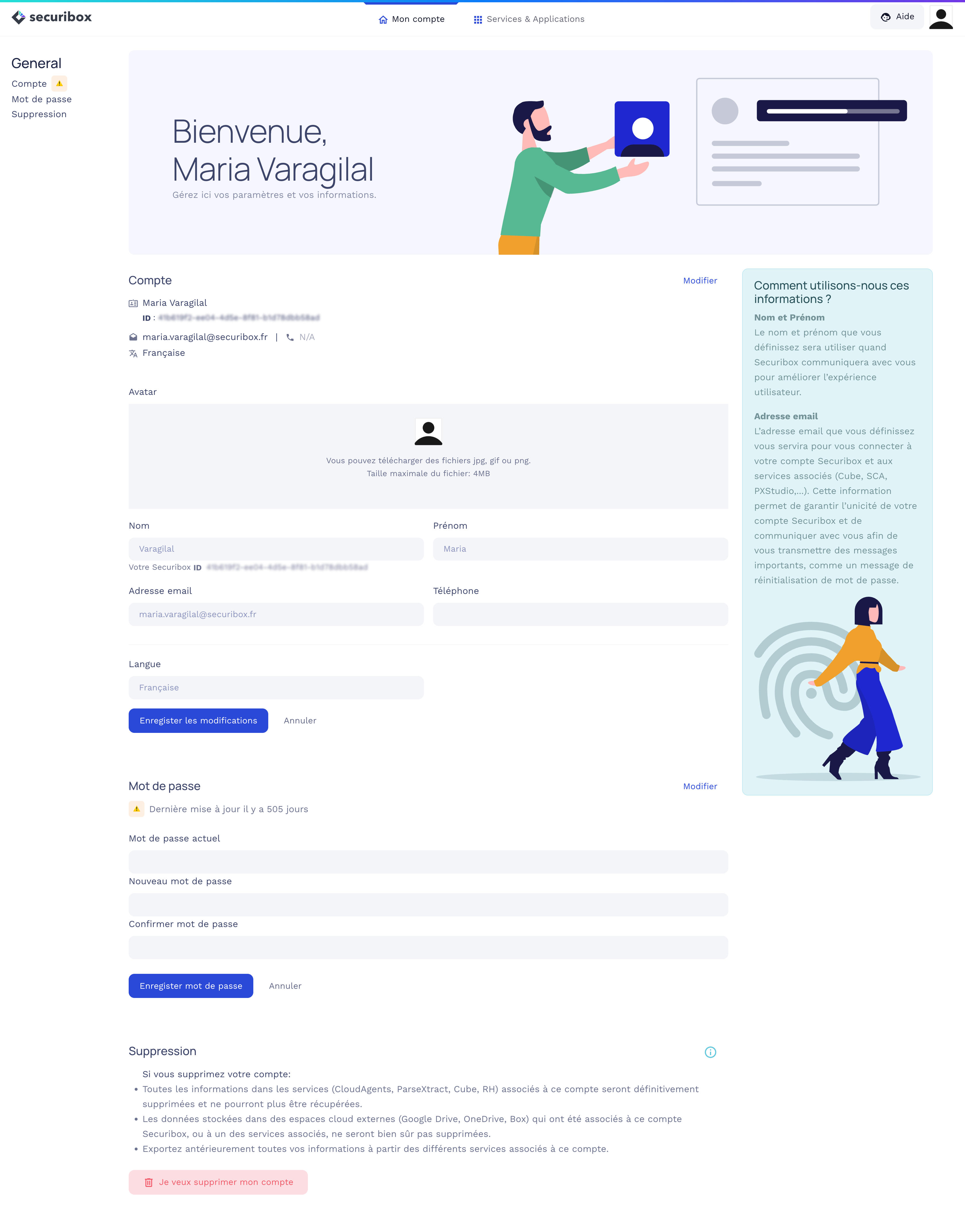
Users had no central place to manage their identity across the Securibox ecosystem. As the platform grew — Cube, SCA, RH, ParseXtract, and client portals — profile edits, password changes, and connected-service visibility were scattered or absent.
Each product either rolled its own account fragment or had none. Users couldn't see which services were connected to their account, couldn't manage credentials from one place, and had no visibility into how their data was used across the platform. The result was friction, redundant support requests, and eroded trust in a platform that needed to feel unified.
The account challenge:
Draw the scope boundary tightly. Me manages identity and ecosystem visibility — product-specific settings stay where they belong.
How do you give users a single home for their identity and connected services — without duplicating product-specific settings or creating another silo?
02 · Key decisions
Account layer, not account product
Drawing the scope boundary.
Me manages what belongs to the user across the ecosystem: profile, credentials, language, data-use transparency, and service connections. It does not manage product-specific settings — Cube's sync preferences stay in Cube, SCA's agent configurations stay in SCA. The decision to enforce this boundary was critical: without it, Me would have become a dumping ground for every product team's settings, growing unwieldy and defeating the purpose of a focused identity hub.
Inline, not buried in a policy
Data-use explanation beside the field.
Each account field (name, email) has a contextual sidebar explaining how Securibox uses that information and why it matters. This wasn't a legal requirement — it was a design decision to build trust. Users editing their email see, in the same view, that it's used for sign-in, password recovery, and cross-product communication. The explanation sits beside the field, not behind a link to a 40-page policy. The same principle extends to account deletion: consequences are listed per-service (CloudAgents, ParseXtract, Cube, RH), external storage caveats are explicit, and export is recommended before the destructive action.
Primitive · Transparency-by-default sidebar
Visible surface, not a hidden panel
Connected services as a tangible grid.
The 'Services & Applications' tab shows every Securibox service connected to the user's account as a card grid with direct actions (Website, Go). This makes the ecosystem tangible — users see the full scope of what their account touches. The app marketplace card ('Add apps, get work done') and search serve discovery, not just management. The 'Recently updated' section at the top gives users a reason to return: awareness of changes across their connected services without visiting each one individually.
Primitive · ConnectedServicesGrid
Primitive reference
- ConnectedServicesGridEvery service on one surface — each card ships Website + Go actions.
- TransparencyPanelPer-field data-use explanation pinned beside the form, visible during edit.
- PasswordStalenessCueDays-since-last-update shown inline — a trust cue that nudges without blocking.
- RecentlyUpdatedFeedCross-service change digest pinned to the top of the hub.
- Account scope boundaryIdentity layer vs product layer stay separate — no mega settings page.
- Transparency-by-default sidebarData-use explanation beside the field, not behind a legal link.
- Destructive action, weighted disclosureAccount deletion lists per-service consequences and recommends export before confirm.
03 · In practice
Two decisions where transparency and discovery were made the default.
Production-informed iteration
Data-use explanation as a persistent panel, not a tooltip.
Each account field needed a contextual explanation of how Securibox uses that data.
A tooltip requires the user to hover and actively seek the information — most won't.
Transparency shouldn't depend on curiosity. If the explanation matters, it should be visible by default — not hidden behind a hover.
Designed the explanation as an always-visible sidebar panel beside the form, not as a tooltip.
Users see how their data is used in the same view where they edit it. Transparency as the default state, not an opt-in.
Edge cases & resilience
Empty state shown from day one — not hidden until there's content.
The 'Recently updated' section needed to handle new accounts with no activity.
Hiding the section until there's content means users never learn it exists.
Showing an empty state establishes the mental model early — users learn this is a place to check back.
Shipped the section empty with 'No updates yet!' rather than hiding it conditionally.
Users discovered the feature before they needed it. The mental model was in place when the first update arrived.
04 · Implementation
Design and code across the account layer.
Design
Account experience
- —Two-tab architecture: 'My account' for identity and credentials, 'Services & Applications' for ecosystem visibility and service management.
- —Sectioned account page with in-page navigation (Account, Password, Delete) and inline edit — no modal interruptions for common tasks.
- —Contextual data-use transparency: per-field explanation sidebar ('How do we use your information?') visible during editing, not hidden behind legal links.
- —Password staleness signal (days since last update) surfaced directly in the UI — a trust cue that nudges without blocking.
- —Account deletion designed as a multi-step disclosure: per-service consequences, external storage caveat, export recommendation, and explicit confirmation — destructive action treated with the weight it deserves.
- —Connected services grid with app cards, sort, search, and direct navigation — making the ecosystem tangible and discoverable.
Code
What was built
- —The live Me hub (me.securibox.eu) implements the specification in coordination with engineering — account UI also lives inside individual product stacks where ownership and release cadence differ by team.
- —Cross-product navigation: consistent top-level header with 'My account' and 'Services & Applications' tabs shared across the Securibox ecosystem entry points.
- —Service card grid with dynamic app data, sort controls, and dual-action pattern (Website + Go) for each connected service.
05 · Results & Metrics
One identity, visible across the ecosystem.
1
Unified identity layer across the Securibox ecosystem.
Inline
Data-use transparency beside each field, not behind a legal link.
All
Connected services visible and manageable from one surface.
Per-service
Account deletion with explicit consequence disclosure.
06 · Trade-offs & Learnings
The hardest boundary to maintain was scope. The decision to keep Me focused on identity and ecosystem visibility meant saying no repeatedly to anything that would dilute that purpose. The alternative was a settings mega-page that would grow with every product release and become nobody's responsibility.
An account hub that shows users what their identity touches — and explains why.
Transparency as a design decision, not a compliance checkbox.