Case study
A back-office
for silent systems.
The SCA BackOffice is where admins configure agents, support teams triage failures, and ops watches the fleet — the management layer for the Securibox CloudAgents solution. The work spanned information architecture, status systems, and the production frontend for a tool where three completely different jobs share the same interface.
- Branding
- Product Design
- Web Design
01 · Context
Three jobs, one surface
They think differently, work at different speeds, and fail differently when the interface doesn't support them. A support operator missing a divergent sync status under time pressure means an account stays broken. An admin editing the wrong agent label means real users see the wrong form.
Clarity for one job is noise for another. The challenge:
Every navigation choice, every status signal, every default view in what follows is either an answer to that question, or it's noise getting in the way.
How do you keep three completely different jobs clear on the same surface?
I came in as the product designer, and the scope was wider than a product UI: the brand mark, the product itself, the public landing page. One pair of eyes across all three — the main reason the visual language holds together.
For the first wave, my handover was design plus HTML & SCSS. I'd prepare the layouts and the markup; a front-end developer put them into the running app. From 2020 I started implementing the front-end directly. The shift mattered less as a role change and more as a feedback loop — a shadow that felt off on a real screen got fixed the same afternoon, instead of being written up in Slack.
The aim was never to become a developer. The aim was for the design to survive the trip from file to browser with nothing lost in translation.
02 · Role
One pair of eyes,
three surfaces.
03 · Identity
A developer-and-operator sub-brand, operational by design.
Before the product had a name on the admin page, it needed one on the door. The CloudAgents mark is two forms — an open arrowhead above, a solid diamond below. Geometric, architectural, unambiguous.
Logo & mark
The blue was chosen for the mark first, then carried into everything else — the product accent, the link colour on the landing page, the highlight on a selected agent card. One blue, three jobs.
- Form — two shapes that read at any scale — chevron above, diamond below.
- One system — same logo grammar across public landing, BackOffice top bar, and embeddable Webview headers; symbol alone where space is tight.
- Blue first — chosen for the mark, then extended through product chrome, links, and selected states so the interface never fights the brand.


Palette
Typography
Display — Headings & section heads
Montserrat
MediumSemiboldBold
Body — BO interface, docs & landing
Poppins
RegularMediumSemibold
Mono — Field definitions, code, webview config
Menlo
Regular
04 · Key decisions
Decisions that kept the jobs clear
at every zoom.
Three doors, not tabs
Separate starting points for separate jobs.
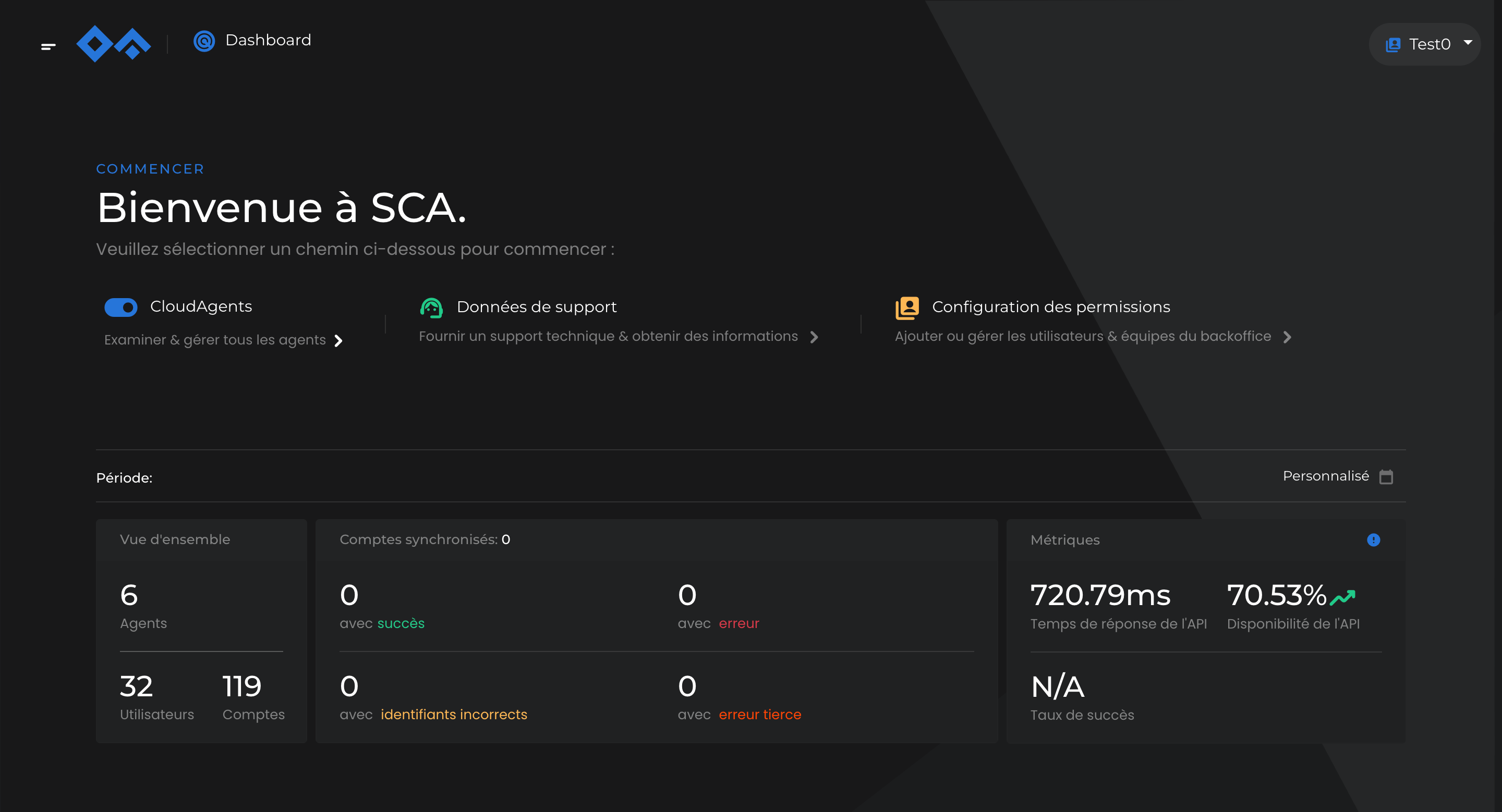
The BackOffice doesn't open to a single workspace. It opens to three — agent management, support and troubleshooting, permission configuration — each a separate starting point rather than a tab among others or a sidebar item with everything else visible at once.
The reason is operational, not cosmetic. The people using each section are in completely different headspaces. An admin editing how an agent collects documents should not, on the wrong click, land in a sync-failure triage view where every minute matters. A support operator scanning failed syncs shouldn't have agent configuration in their peripheral vision.
Above the three doors sits a glanceable summary — agent count, account count, sync health, API availability. You know the state of the system before you choose where to go.
Primitive · Three doors, not tabs
Top-level doors
- 01
Agent management
Admins — catalogue, schedules, labels
- 02
Support & troubleshooting
Support — individual accounts, sync failures
- 03
Permission configuration
Ops — roles, access
— dashboard summary sits above all three —
One chip bar, two surfaces
The filter chip bar as a product-wide primitive.
The same chip bar runs the agents index and the support queue. The furniture stays, the nouns change. On agents: Type, Usage, Availability, Status, Category. On support: account ID, process, sync. An admin scanning one surface carries the mental model directly into the other — onboarding is halved, context switching is cheap.
A second question inside this decision: what happens to items that don't match. In early drafts they vanished. That broke the mental model for admins, who often come in looking for a specific agent whose status they've forgotten.
So unavailable agents stay on screen, dimmed, with a persistent activate action floating on hover. The filter reveals what's relevant; it doesn't hide what isn't.
Primitive · FilterChipBar
Filter chips · agents index
Find before you open
Signal before drill-down — what the grid shows without clicking
The agents index is where every admin session starts. The decision that shapes it is what each card carries on its face. Every card shows account count and success rate without needing to be opened — so the operator can scan hundreds of agents and know which ones deserve a closer look, before committing to any of them.
At this scale, that's the difference between spotting the one agent that needs attention and having to open fifty detail pages to locate it. The operator's eye does the searching; the grid makes the searching cheap.
Primitive · AgentCard
Two signals per sync
Never merge process health with client delivery — they diverge in the field.
Open a support ticket and every sync shows two statuses side by side: did the sync process work, and did the delivery report land. They look related, but they can tell completely different stories — a sync can complete cleanly on our side while its webhook delivery fails on the client's side. Collapsing them into a single status pill hides exactly the information an operator needs to know where to look next.
At scale, most sync cycles return nothing new to download. That's not a problem — most users don't get a fresh bill every day. Treating nothing new as an error would flood the interface with false noise, so it's its own neutral state, the second most common state after success.
The drill-down places the re-launch button right next to the sync history, because the person reading a failure usually needs to act on it immediately.
Primitive · DualStatusRow
Two questions, answered separately
- 01
Sync
Did the sync process run to completion?
On our side. Login, navigation, retrieval, parsing.
- 02
Delivery
Did the report land with the client?
On their side. Webhook, SFTP, receipt.
The colour vocabulary behind the statuses
Success
Completed cleanly, report delivered.
Error
The sync failed on our side.
Identity
Wrong credentials — the user's own fix.
Third party
The other end broke. Not ours to mend.
Neutral
Nothing new to download — normal at scale.
A sync can succeed while its delivery fails. Collapsing them hides exactly the information support needs.
The reason two columns exist
Five answers on one page
Agent detail stays scannable: a quiet status stack and a chart that shares the same colour vocabulary.
The agent-detail screen is the busiest surface in the product. Admins drop into it when something looks off. In a few seconds they want: is the agent even on, how many accounts are syncing, what's the success rate, how is today looking, and where did the last failures cluster? I split the page into two zones.
On the left, a quiet stack of status and controls — the kind of figures you read by glancing down the margin of a book. On the right, the chart: failures are magenta, third-party errors are ochre, successes are the neutral tone. No legend is needed, because the colour vocabulary carries over from the status system — the same magenta that spikes here tags a failed sync card in the support queue.
2zones
Status + chart, left and right
5roles
Colours that mean the same everywhere
0
Chart legends — colour does the work
Colour here is a vocabulary, not a palette. Magenta is a failure everywhere it appears.
Principle carried across the product
FR · EN · PT, inline
Inline language tabs wherever an admin authors localised agent content.
CloudAgents ships in French, English, and European Portuguese. Any modal where localised agent content is authored — agent names, field labels that the end user will read — carries its own set of language tabs at the top.
The practical win: one click to flip between language versions of the same label, without leaving the modal, without losing your place. Admins often write the three versions in the same session — the tabs remove the penalty for doing so.
Primitive · LanguageTabs
Content language tabs · edit modal
Both themes from day one
Light and dark as equals in 2015 — tuned for long sessions, not for trend.
When this shipped, macOS didn't have Dark Mode yet — that came in 2018. iOS wouldn't get it until 2019. CloudAgents had both themes from day one, for two reasons.
One: SCA is a technical product. A dark surface is the right finish for something engineers and ops teams sit in front of.
Two: the people inside this product stare at status counters for long stretches. A dark, low-contrast surface is simply less tiring than a bright card on bright paper, six hours in.
Both themes existed from the start, in the same file, treated as equals. Neither is a colour inversion of the other — warm paper in light becomes cool graphite in dark, shadows lose their tint and become borders, cards drop their backgrounds and keep their outlines. Same vocabulary, different volume.
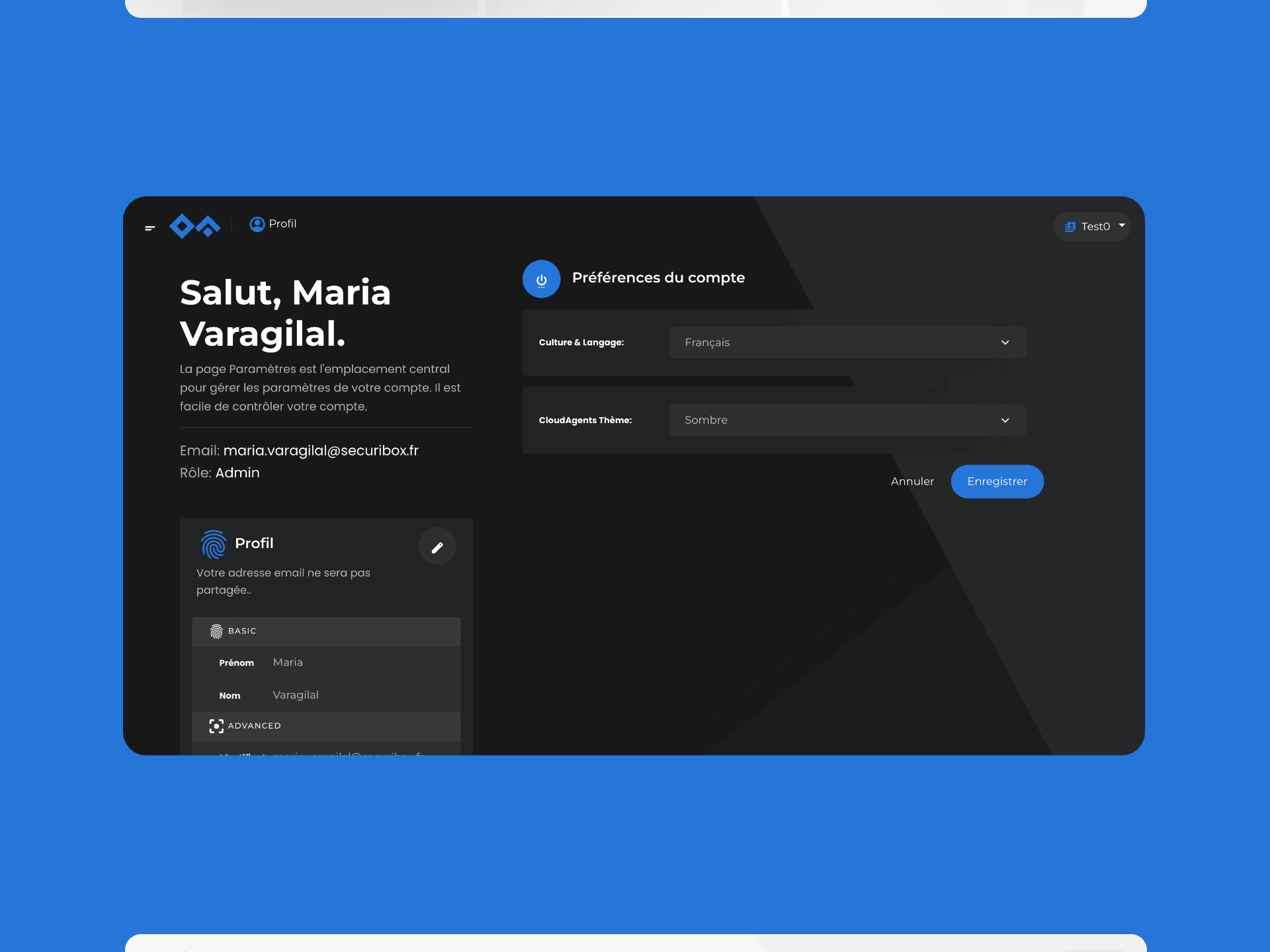
Theme and language aren't nice-to-haves. They're working conditions — and Settings is where they belong.
Because contrast and language shouldn't compete for space with agent permissions and sync schedules.
Primitive reference
- FilterChipBarOne chip bar runs agents and support — same furniture, different nouns.
- AgentCardGrid card exposes account count and success rate on its face.
- DualStatusRowTwo status pills per sync — process and delivery — never collapsed.
- LanguageTabsFR · EN · PT tabs inline in any modal that authors localised content.
- StatPanelAggregate strip above every drill-down.
- WebviewConfigPanelSplit config + live preview; clients see the embed update as they type.
- PermissionsMatrixRole × resource grid, batched save, inherited cells marked.
- Three doors, not tabsSeparate starting points per job — no shared sidebar, no silent context switch.
- Glance before drill-downEvery surface opens with aggregate health above the list.
- Dense support row, inline actionRe-launch sits next to sync history. Action where debugging happens.
- Colour vocabulary, not paletteFive roles carry the same meaning across BackOffice, Webview, charts.
05 · Always on
Flagging, whatever the hour.
Failures don't wait for office hours. The product had to let support spot what was happening and flag it the moment it occurred — whenever that happened to be. Dark mode is the default for anyone working outside daylight hours; chart colours stay semantically intact but desaturate, so a run of red failures doesn't burn the eyes. Status pills keep their hue but lose their bright backgrounds. Elevation is expressed through one-pixel borders, not shadows — because shadows don't read on a grey surface.
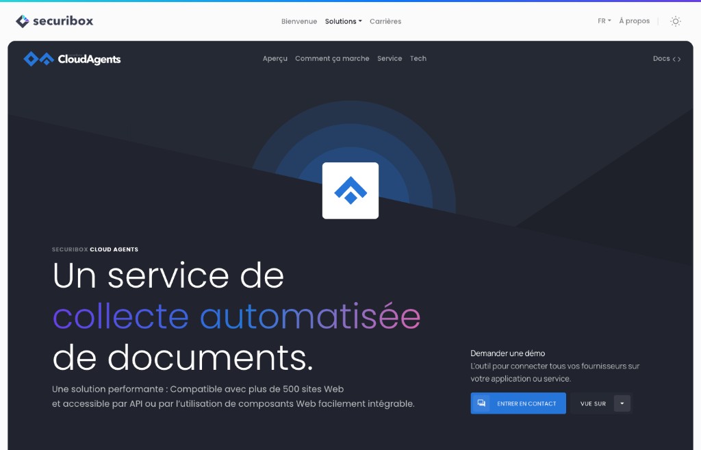
06 · Landing page
The outside of the same house.
The brand doesn't end at the product. The CloudAgents landing page extends the same visual language — the mark up top, the one blue, the generous rhythm — into Securibox's public surface. It explains the product to developers deciding whether to integrate, and to prospects deciding whether to demo. Same vocabulary; the audience changes, the grammar doesn't.
Same designer all the way through, which is why the blue on the Demander une démo button is the same blue as the selected agent card in the back-office.
07 · In practice
Two that went deeper.
Proactive & collaborative
Webview live preview — self-service customisation instead of back-and-forth.
Clients needed to customise the embeddable Webview appearance — logo, colours, theme, fonts, consent text.
Every visual change required clients to describe what they wanted and wait for the team to apply it. The feedback loop was slow and error-prone.
If clients can see the result in real time, they stop requesting changes and start making them. Ownership shifts from the team to the client.
Added a live preview pane beside the configuration form — clients see the Webview update as they adjust settings, and a generated embed link sits inside the same surface.
Clients customise independently. Support requests for visual changes dropped. The configuration surface became a self-service tool.
Systems thinking
Three top-level doors — separating jobs at architecture level.
Admins, support, and ops share the same BackOffice platform but work at different speeds and fail differently.
A unified navigation risks someone editing agent definitions accidentally landing in sync failure triage.
The people using each section are in completely different headspaces. Navigation should reflect job boundaries, not product structure.
Three distinct starting points — agent management, support/troubleshooting, permission configuration. Not tabs, not a sidebar with everything visible.
Each job starts from its own entry point. The dashboard gives aggregate health before drill-down.
08 · Implementation
Design and code across the developer-operator platform.
Design
Brand & positioning
- —SCA logo and visual identity — within the Securibox family, related but not interchangeable with consumer-facing Cube.
- —Brand application: guidelines and patterns across BackOffice, Webview, and the public landing.
- —CloudAgents is introduced before anyone sees the BackOffice — the public page leads with the integration model (API, SDK, Webview) and positions documentation as primary navigation, not a footer afterthought. For developers, docs are the product's first impression; for operations, the benefit structure and security posture build trust before the demo ask.
- —Page structure: flow moves from what SCA does (automated document collection), to how it integrates (API, SDK, Webview paths with code examples), to why it's safe (SSL, CSRF, AES-256 encryption, rotating keys) — each layer answering the next objection.
- —Two audiences, one page: developers scanning for integration flexibility and operations teams looking for reliability signals both need to find their answer without reading the other's.
Product experience
- —BackOffice information architecture: three top-level doors kept apart (agents, support, permissions), with a dashboard that gives aggregate health — agent count, sync states, API availability — before any drill-down.
- —Agent management: card grid with filtering and hover-preview so operators get signal before committing to a detail view; agent detail with sync activity chart and breakdown metrics.
- —Troubleshooting & support: tabbed support list with per-account history, inline reschedule and sync launch — the investigation workflow sits where debugging happens.
- —Embeddable Webview: a configuration surface where clients shape how the Webview looks (logo, colours, theme, fonts, consent text) with a live preview and generated embeddable link — while security behaviour stays platform-owned.
- —Operator environment: profile with role-based identity, language and theme preferences; dark and light themes tuned for density and legibility across long sessions.
Code
Code
- —Redux store split by API domain — `axios` thunks, per-operation loading keys, reducers that shape payloads on the way in. The store holds server data; the UI owns its own view state.
- —Transient state (filters, search, toggles) lives in `useState`. What needs to survive a refresh or a shared link goes to the URL — routes, params, deep links like analytics `agentId`.
- —Filtering adapts to the shape of the data: small, bounded lists filter instantly in-memory (`useMemo` + normalized text match + Ramda sort); larger or paginated ones round-trip to the API so results stay truthful instead of filtering a stale snapshot.
- —Small things that make it feel finished: Loading-aware actions (disabled while pending), toast on failure, i18n for operator copy, sanitization & download helpers at the boundaries.
- —File flows: image upload with live preview and base64 hand-off for branding; certificate and log downloads streamed as blobs through the same secure-download path.
- —Multi-step Bootstrap modals (category create/edit) with local step state, back/next gating, per-step validation, and submit wired to create/update thunks.
09 · Results & Metrics
Operator depth, developer flexibility.
6
Operational sections in the BackOffice, each with role-based permissions.
500+
Agents signalled at grid level, with hover-preview and filter-first discovery.
3
Languages supported across interface and content — French, English, Portuguese.
2
Themes — light and dark — tuned for long operator sessions since 2015.
10 · Trade-offs & Learnings
What it cost, what it taught.
— Some connections are naturally discoverable. CloudAgents and Statistiques are tightly linked — the agent detail links directly to 'Open in Statistiques', and users move between isolated and aggregate views without losing context. Support operates at the account level, and the transition between support and account management is straightforward enough that it doesn't require explicit linking.
— This structure reflects the product's original 2015 build. Today, it could evolve to better align with how it's actually used — shifting the BackOffice toward a support-first workflow as the primary entry point, with agent configuration and permissions becoming secondary entry points.
— The BackOffice was designed to support the configuration and management of agents. Each section is internally coherent, while the relationships between them remain intentionally implicit — the cost of the three-door clarity is that the bridges between jobs sometimes need to be re-discovered rather than signposted.
Three jobs, one surface — each clear at every level of zoom.
From grid overview to account-level sync history, the path never breaks.