Case study
One company, carried by a single visual vocabulary.
Created the Securibox brand identity from scratch — logo, colour system, typography, imagery rules — and designed and built every public-facing page: corporate site, solution pages (CloudAgents, ParseXtract), about, careers, and contact. Then extended this foundation into a Unified Solutions Brand that carries across all product UIs, sub-brands, and white-label surfaces in production.
- Branding
- Web Design
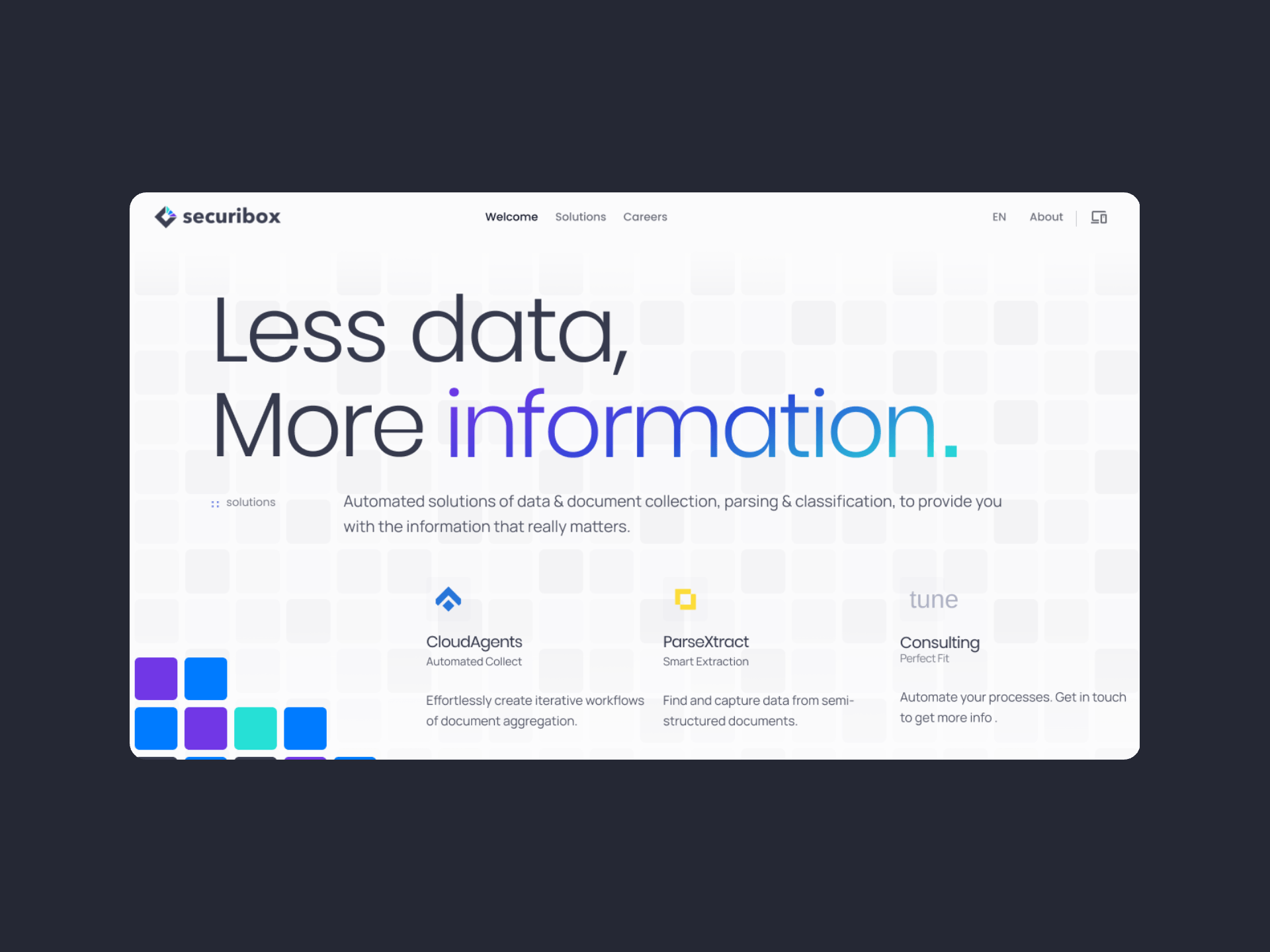
01 · Context
Designing a cohesive system.
Securibox had no established brand identity. As the company expanded from original document-management service into multiple solutions, each product emerged with its own visual language and no shared foundation.
The corporate site needed to present a credible, unified platform to enterprise prospects. Solution pages needed to introduce technical products to both developers and business decision-makers. Without a brand, a visual language, or a page strategy, every touchpoint told a different story — fragmenting trust in a company that needed to feel like one reliable partner.
Every decision began with one question:
Each touchpoint, each page, each sub-brand had to pass that filter before it shipped.
Does this make Securibox feel like one trusted company — or multiple separate tools?
02 · Identity
A family identity, flexed per audience.
The Securibox identity was built to carry the whole family — corporate site, product UIs, and white-label surfaces. With the unified brand mission set as decision filters, the identity had a clear brief to answer to: anchor in trust and professionalism, then flex per audience without fragmenting. The mark is the mission made visible — an enclosing diamond holding three directional axes converging into a single form, so the brand carries Analyze, Organize & Visualize before a single word is read.
Logo & mark
The icon is the mission made visual — and every element in it carries part of it. An open diamond — not a sealed box — holds the family and states the secure boundary plain. Three axes from one point encode Analyze, Organize, and Visualize, converging into a single form rather than fragmenting as services multiply.
The wordmark had to carry the same weight independently — 'Less data, More information' applied to the identity itself: unadorned, strong, legible at any size


Structure
The mark, labelled.
- 01
Enclosing diamond
The frame that holds the family and makes the brand name's promise visible — a secure boundary, stated plainly. The mission starts here, before any service is named.
- 02
Three axes
Three axes, one form — one per part of the unified brand mission: Analyze, Organize & Visualize. Each exact in direction, converging into a single form rather than fragmenting the family. Services emerge from the mission brand.
- 03
Wordmark
'Less data, More information' at identity scale. Strong, unadorned, legible at any size — a clear picture on its own, independent of the icon.
— each part of the logo carries part of the mission —
Palette
Typography
Display — Corporate & solution headlines
Poppins
MediumSemiboldBold
Body — Product UIs & long form
Manrope
RegularMediumSemibold
Mono — Code samples & integration snippets
SFMono
Regular
03 · Key decisions
From scattered touchpoints to one coherent Securibox
Map the fragmentation before drawing the fix
Brand & Experience Audit
Mapped every touchpoint — portals, mobile, emails, onboarding, public pages, and internal tools. The company had grown without a cohesive visual identity, and each surface had drifted into its own aesthetic. This work became the baseline for the new positioning and a clearer articulation of what the brand did.
Unified brand mission as decision filters
Unified Brand Mission
Translated 'Less data, More information' into a unified brand mission — Analyze, Organize & Visualize — that governed every decision, from the logo mark to the page hierarchy on solution pages to the tone of security copy. Services follow from the mission brand; the mark carries the mission, not the product list.
Identity designed, stress-tested on public pages
Identity, Visual Language & Public Pages
Designed the Securibox logo and core visual identity from scratch — colour system, typography scale, imagery direction, and application rules. Then designed and built every public-facing page: the corporate homepage (solutions overview, partner credibility, journal, careers CTA), the about page (mission, team, offices, contact), and dedicated solution pages for CloudAgents and ParseXtract — each with its own content strategy, integration diagrams, security narrative, and audience-specific flow. Built the brand library in Sketch and later migrated to Figma.
Brand beyond screens — templates for the whole company
Brand Library & Company Assets
Built the brand library in Sketch and defined core company resources — logo usage rules, presentation templates, documentation templates, and internal collateral — so the identity works beyond screens and every team can produce on-brand materials.
One shared foundation, not six parallel builds
Design Language in Production
Implemented the full visual language in production using Gatsby for static marketing properties and Bootstrap configuration as the shared styling foundation. The corporate site, solution pages, and sub-brand properties all draw from the same build and shared rules — so design specs and shipped CSS stay aligned without a separate documentation layer.
04 · In practice
Two edge cases that taught the product.
Systems thinking
Bootstrap as shared styling foundation — not a limitation, a leverage point.
Needed a consistent styling system across six properties maintained by one designer.
Custom CSS per property would create drift and maintenance overhead at the scale of a solo design-to-code workflow.
A framework with established conventions reduces documentation overhead — the configuration becomes the spec.
Adopted Bootstrap as the shared styling foundation. Brand applied through configuration, not custom builds.
Design specs and shipped CSS draw from the same source across all properties. One person can maintain consistency at platform scale.
Design rationale
Corporate site designed as the brand's first expression — not an afterthought.
The brand identity needed its first public validation before being extended to product UIs.
Getting it wrong on a public page would undermine the entire system before it reached internal surfaces.
Every decision made on the corporate site — colour, type, hierarchy, tone — becomes the reference point for everything that follows.
Designed and shipped the corporate site and solution pages first. Every brand decision was stress-tested publicly before entering product UIs.
The public site became the living brand reference. Product UIs inherit from a foundation that was already validated with external audiences.
05 · Implementation
Design and code across the brand's public surface.
Design
Brand identity
- —Securibox logo and mark: designed from scratch — a symbol system that works at favicon scale and on enterprise presentations alike.
- —Colour system: three mission colours — Analyze, Organize, Visualize — anchored in trust and professionalism, extended with solution-specific accents for sub-brands (Cube, SCA, PX) as services emerged from the mission.
- —Typography scale: hierarchy rules for headings, body, and code samples — consistent across marketing pages and product UIs.
- —Imagery direction: illustration style, icon system (Material Design integration), and photography tone — serious enough for regulated contexts, approachable enough for developer audiences.
Public pages — strategy & design
- —Page strategy for the corporate site and solution pages — content hierarchy, audience flow, and conversion structure designed so each page works as a standalone entry point.
- —Solution pages shaped by audience: developers scan for integration paths and code examples; business decision-makers scan for trust signals and security posture. Same page, two reading lines.
- —Integration diagrams and process flows designed as page components — visual explanations of technical architecture (agent pipeline, extraction pipeline) that do the heavy lifting so the copy stays lean.
- —Shared patterns across all public pages: security narrative block, contact CTA, GDPR-compliant form copy — consistent but not templated.
Unified language & touchpoints
- —Unified Solutions Brand: one design language across the corporate site, six product UIs, white-label portals, and client-facing surfaces — shared foundations, not shared templates.
- —Reusable hierarchy, spacing, grids, and UI patterns serving marketing pages, logged-in applications, onboarding, and email.
- —Sub-brand architecture: Cube, SCA, RH, Securibox ID, Me, and PX each have their own expression within the family — distinct audiences, coherent identity.
- —Coverage mapped to real channels: public sites, product UIs, account and auth entry points, HR and operator surfaces, enterprise client portals
Code
Corporate site
- —Gatsby: all public pages — homepage, about, solutions, documentation, and legal — built as static sites with responsive layouts and the design language applied directly in production.
- —Accessibility: WCAG-oriented patterns built into every page from the start.
Shared styling foundation
- —Bootstrap: brand applied through shared configuration — grids, components, and consistent rules — so design specs and shipped CSS draw from the same source across properties.
Company resources
- —Logo assets, presentation templates, and documentation templates delivered alongside the digital properties.
06 · Results & Metrics
A platform-scale identity, shipped from one source.
1
Brand identity created — logo, colour system, typography, imagery direction.
6
Properties and sub-brands carrying the same design language in production.
All
Corporate site and solution pages designed, built, and shipped — the company's primary external face.
1
Shared styling foundation — design specs and CSS from one source across properties.
07 · Trade-offs & Learnings
What the first expression taught.
— Prioritising shared principles over visual flourish meant scaling back early design iterations. Adoption across teams mattered more than any single page looking its best in isolation.
— Unification proved to be as much about culture as design. The identity was built to remain resilient even as teams evolve and new products are introduced.
Define what matters, shrink the space between design and production.
One logo, one language, one build. The brand is the language.